We recently launched an overhaul to our landing and about pages. These are all the pages that aren’t part of the app, pages like Home, Business Class, Trello Gold, Tour, and Jobs. We call them the “meta” pages because we’re nerds and because it’s not just landing pages, but also things like log-in and sign-up. Take a minute to look around.
At the beginning of our Trelloic journey, we had very few meta pages. Because Trello is a single-page app, we just rolled the meta pages into the client code. That had some obvious problems. It meant you had to download all the JavaScript and CSS and templates for the app just to view something like the Trello Gold page. We made this a little nicer for some pages, but it was still a mess and wasn’t going to scale. Another problem was that these pages didn’t have a consistent look and feel. They were made at different times by different people with different motivations.
We couldn’t let this stand, so we set out to overhaul them. There were two parts of the project: separating the meta page code from the main app, and designing and developing the pages.
Project Metosis
Trello developer and all around good guy Daniel LeCheminant worked on the server component. I called this Project Metosis, a dividing of the “meta” pages, although nobody seemed to care about my clever codename as much as I did. *slumps in chair*
Metosis works like this: when you visit a page like https://trello.com/business-class, there is some server code, some middleware, that looks at the URL and sees if it matches something in the Meta project, which is in a place separate from the client code. If it finds a business-class.html, it short circuits and sends you static files from memory instead of loading the app.
Hold on. Serving static files from a file system? I know. It’s honestly only a little bit faster and fancier than uploading via FTP.
There are over 10,000 benefits to this method, but I’ll highlight the big ones.
- We can deploy changes in the Meta project without going through the client release pipeline. Nothing is tied up and we don’t have to release a whole new client just to add a job listing, which we plan to do often apply today for a good job yes.
- It’s mega-fast. These are small static files served directly. There’s very little DOM manipulation and the bare minimum CSS, so once it gets to the screen, it renders in a flash.
- We only have the HTML, CSS, and JavaScript we need for either the client or meta projects. That means we can cut lotsa code. Our CSS is now 202kb raw and 43.3kb compressed, down from 276kb raw and 58kb compressed. That’s Twenty-Nine Percent (29%) smaller. The reduction in JavaScript was a bit more modest: 443kb down to 410kb, about 8% smaller. Not bad.
- You know how nice it is to watch and listen to a quill swiftly write on fresh parchment? You know how it feels to bite into a hot, fresh-out-of-the-oven donut? For developers, safely cutting a bunch of code is better than both of those feelings. This doesn’t really need to be its own item, sorry.
- The code is isolated and we don’t have to worry about cascading rules running amok or extraneous scripts bogging down either project. For instance, we noticed that a wild CSS rule on one of our landing pages was causing filtering to be incredibly slow. There should be less of that now.
So Daniel had the “load it fast” part down. Now I needed to make the pages.
Project Marquee

I called the designing and making of these pages Project Marquee. The name is not as good as Metosis and no one really cared anyway, but whatever. I’m still going to use codenames.
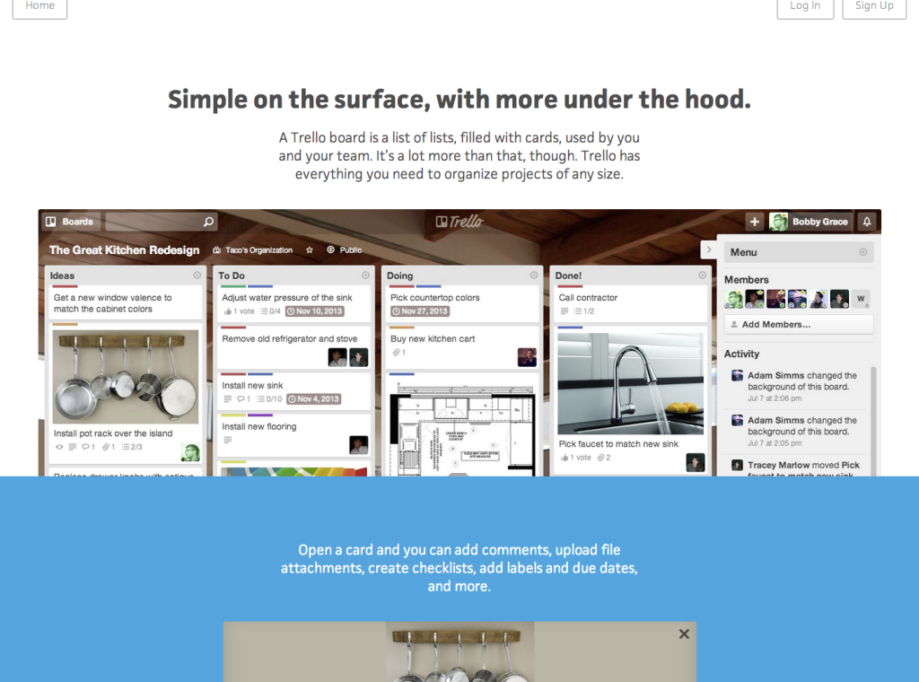
Here’s what I wanted out of the design. I wanted a simple, mobile-friendly layout. I wanted consistent typography. I wanted to use words, but not waste them. I wanted everything up front and visible, nothing buried. Just about the only things you click are links that take you to new pages where you get more information you want. I wanted to show a big screenshot of exactly what Trello looks like so people get it quickly.
Here’s what I didn’t want. I didn’t want any dizzying and confusing scroll effects, images carousels people wouldn’t click through, tabs or hover effects people would miss, or expensive videos people wouldn’t finish. I consider these big, whizz-bang ornaments that obscure the message.
Above all, I wanted to explain what Trello can do for you, convey what people love about it and explain why you might love it, too. I figured I could do that quickly and effectively with some concise words, a few images, and without all the doodads.
The straightforward design made it easy to develop. It wasn’t long before it was ready to ship.
Shipping
Just before our big announcement, Michael Pryor, CEO of Trello, said if there was anything we wanted to get out we should get it out now. So we wrapped up the last of the project and launched. Then Michael said “No, switch the home page back to the old one” and we were like ”Michael, you just told us to launch” and he said “What if less people sign up with the new page? Better the devil you know…” and we were like “Well. Okay.”
So we converted the old home page to the new meta project, added a bunch of analytics, and A/B tested it. 50% of new people saw the old version, 50% saw the new version, and we recorded which one get more people to sign-up. We found the new page had a sign-up rate of 14% while the old page was around 11%. And it was statistically significant. Great!
It was worth the hassle of setting up the test in the end. We have much better analytics and we are in a better place to test changes in the future. Maybe we’ll test something really out there. Be sure to tell all you friends about trello.com and ask them if they see something cool on the homepage or sign up if you haven’t! (Ed. note: I hope this plan works.)
Why does it get more people to sign up? There’s no way to be 100% sure. It could be because it’s faster. It could be because the pages are better at explaining the product and piquing their interest. Thankfully, we can test more things and get a better sense. Hey, what if we made the pages slower? Think that would get more people to sign up? Who knows…
Really there are two parts of this: getting people to sign up for Trello and then making them happy, active users. The new landing pages get more people into Trello (✓). Now we need to make sure new users have everything they need to be happy and active and get the most out of Trello (without being overly helpful). That’s something we’re working on.
The journey is far from over, but we are in a much better place now. Our landing pages are mega-fast, looking nice and consistent, we can push out updates faster, we can test changes more easily, and the code is cleaner, more maintainable and less error-prone. On to the next adventure!