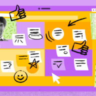


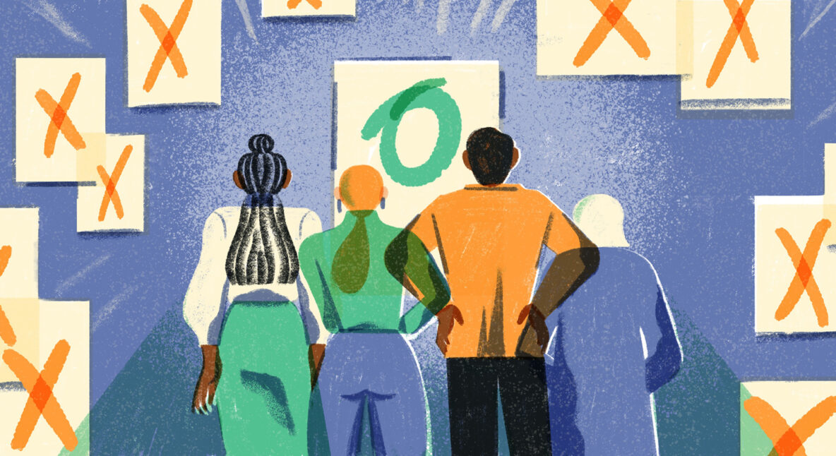
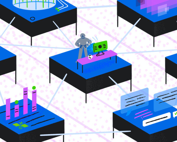
This is how effective teams navigate the decision-making process
Zero Magic 8 Balls required.

 Office attendance doesn’t drive team connection. So what does?
 Lessons learned: 1,000 days of distributed at Atlassian
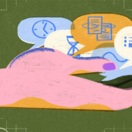
 New research: How to make time for the work that matters
 Here’s what remote workers need to be productive
More in Distributed Work
Here’s what remote workers need to be productive
More in Distributed Work
 How we’ve built successful DEI partnerships at Atlassian
 Is situational leadership the best leadership style?
 Better together: 8 essential teamwork skills to master
 7 icebreaker games to help your team build authentic connections
More in Teamwork
Is situational leadership the best leadership style?
7 icebreaker games to help your team build authentic connections
More in Teamwork
Is situational leadership the best leadership style?
 Four things I learned as an interim engineering manager
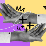
 How to deliver and receive constructive criticism
 How to honor what makes you unique with your career
More in Leadership
How to honor what makes you unique with your career
More in Leadership
 4 communication styles and how to navigate them in the workplace
 5 ways to foster inclusive communication in the workplace
 10 lessons to unlearn for better communication at work
 Toxic positivity at work: how to spot it and squash it
More in Communication
Toxic positivity at work: how to spot it and squash it
More in Communication
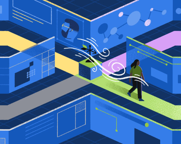
 AI is changing work for the better – here’s how
 7 sneaky ways friction is making your work life harder
 How to build critical thinking skills for better decision-making
 The truth about compressed workweeks, according to people who’ve done it
More in Productivity
The truth about compressed workweeks, according to people who’ve done it
More in Productivity
 Translating principles to practice: Our No-BS Guide to Responsible Tech Reviews
 3 ways to center equity in the workplace
 How understanding the concept of value exchange can strengthen your workplace relationships
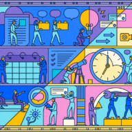 Organize the chaos: 5 steps to effective change management
More in Strategy
Organize the chaos: 5 steps to effective change management
More in Strategy


Work Life is Atlassian’s flagship publication dedicated to unleashing the potential of every team through real-life advice, inspiring stories, and thoughtful perspectives from leaders around the world.
Learn more about Work Life


Zero Magic 8 Balls required.

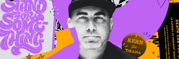
Our investment in these organizations creates a more diverse talent pool, not just for Atlassian, but for the entire industry.
Two AI experts weigh in on how the technology can help teams do more and collaborate better.
"Best" is relative when you’re dealing with humans. The most-effective approach is the one that allows for flexibility.

I came away with a new appreciation for all the work (visible and invisible) managers do.

Get articles like these delivered to your inbox every two weeks.

Use these strategies to align expectations, streamline communication, and crush your goals.
Huggy Rao, co-author of The Friction Project, on the practices and processes that may be holding you back.
Getting feedback can be intimidating, but avoiding it only makes things worse.

Healthy teams enjoy benefits that go far beyond the company's bottom line.