

If you need proof that the cliché about “best laid plans” is rooted in truth, look no further than your work projects.
Your typical process might look a little something like this: You and your team have a big project on your plate—like revamping your client onboarding process. You break it into smaller tasks (because you know those little wins will keep you moving) and hash out a plan to get it done by your deadline.
But of course, other more time-pressing things keep creeping in. Before you know it, the project deadline is looming and you haven’t done half of the tasks you were supposed to do. Cue the mad dash and (in most cases) the inevitable deadline extension.
This scenario is frustrating for you, your team, and anyone else who is relying on your timely completion of the work. Fortunately, implementing a burndown chart is the perfect solution for keeping a closer eye on your project timeline and task progress.
What Is A Burndown Chart?
To put it simply, a burndown chart measures the work progress for a specific project. It shows you the amount of work completed, as well as the amount of work remaining.
The horizontal axis of the chart displays the amount of time available for the project, while the vertical axis shows the number of tasks that should be completed during that time.
Burndown charts are most frequently used on Agile teams to plan and track the work completed in a specific Sprint (a short period of work). However, while these charts started as an Agile concept, they’ve gained popularity across all types of teams and projects.
Here are the nuts and bolts: Every burndown chart should include a guideline that details what your ideal project progress looks like. As you work on the project, you’ll track your actual task completion, which will be color-coded appropriately. You want your “actual” line to parallel your “ideal” line as closely as possible.
A Simple Burndown Chart Example
The easiest way to understand a burndown chart is by looking at one. So, let’s take a peek at a basic burndown chart example using the scenario we set up in the introduction: You and your team need to overhaul your client onboarding process.
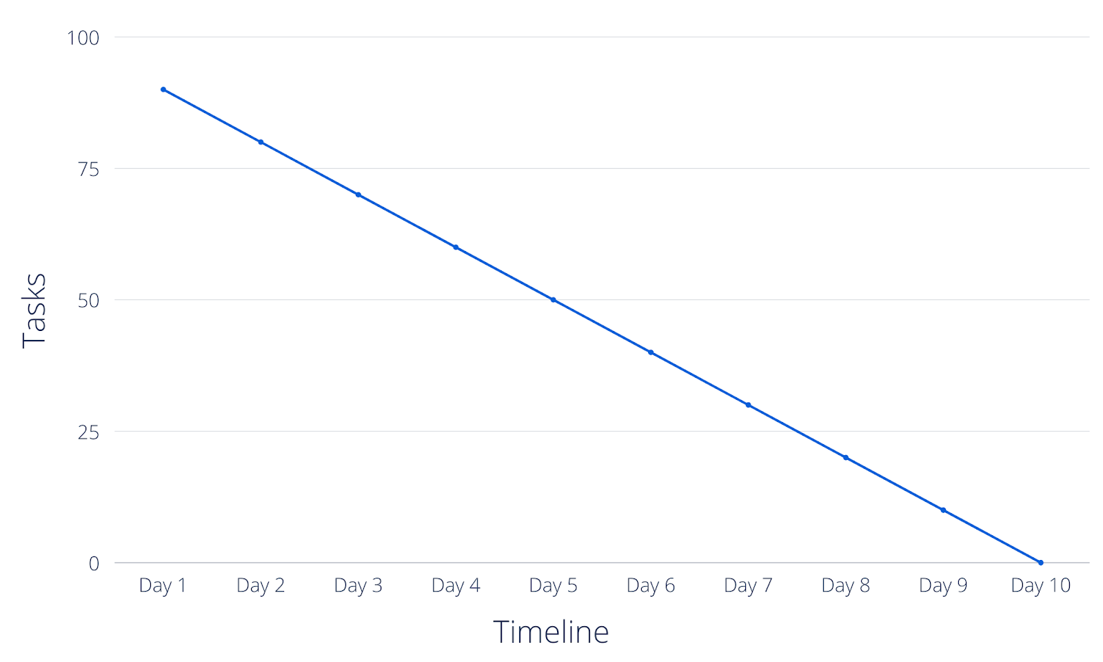
To keep it simple, let’s say there are 100 total project tasks to complete and 10 allotted days to complete them. Although not the most realistic timeline, the intention for this example is to keep the math easy. On the vertical axis, you’ll note 100 tasks and on the horizontal axis, you’ll note 10 days.
Next, you’ll plot your “ideal” line. For nearly every project, your best approach is to work at a consistent pace. In this scenario, that’d mean completing about 10 tasks per day (because 10 tasks over the course of 10 days will total the 100 tasks you need to complete).
With your “ideal” line in place, you now have a simple representation of what your project progress should look like. As you and your team complete tasks, you should plot the project progress you actually made on your burndown chart.
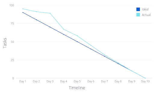
If you only complete five tasks on the first day, four tasks on the second day, and two tasks on the third day, you’ll see that you’re falling behind schedule—because your “actual” line isn’t keeping pace with your “ideal” line.
Your team would need to hustle to catch up. As a result, you’d crank through more than your allotted tasks over the next few days. At the end of the project, your finished burndown chart might end up looking like this:
3 Benefits Of A Burndown Chart
Now that you have a visual of what a burndown chart looks like, the concept hopefully isn’t as complicated as you originally thought. If you’re wondering whether or not it’s worth going through the work to create one, let’s take a look at some advantages.
1. Work Smarter
Your burndown chart will reveal a lot of information about how you and your team are getting your work done, including insights on:
- Where you work quickly and get ahead of schedule (and how you can replicate that)
- Where you hit bottlenecks and impediments
- How much work you have left to accomplish by your deadline
This is all valuable information you can use to improve your processes. This chart will help get your current project back on track while simultaneously improving future projects.
Let’s refer back to our example of the onboarding project and why there was such a slow start at the beginning. It’s important to evaluate why your team only completed a handful of tasks (instead of the 10 tasks you planned for) during those first three days.
After having this conversation with your team, you might uncover that they didn’t have enough required information and had to spend time gathering additional details. Moving forward, you now recognize that you need to host a stronger project kickoff meeting and use a templated project brief in order to better assist your team. This way, they will be equipped with everything they need to hit the ground running from day one.
2. Prevent Team Burnout
Remember, the goal of your burndown chart is to follow the “ideal” line as closely as possible—meaning tasks should be accomplished at a consistent pace.
That steady approach helps you and your team eat the elephant one bite at a time, rather than dealing with the frantic cram session to finish your project before the deadline. When
concentrated and stressful bursts of work become the norm, everything feels urgent and you run the risk of experiencing team-wide overwhelm that eventually leads to burnout.
Research from LinkedIn learning states that 70% of employees identify their workloads as their biggest driver of stress at work. This is a good sign that managers need to take steps to understand bandwidth and maintain realistic expectations. A burndown chart helps you spread project work out evenly—rather than everybody scrambling to get over the finish line.
3. Deliver Projects On Time
Finally, the biggest benefit of them all: Your burndown chart can help you and your team wrap up your projects on time, rather than watching helplessly as your deadline slips through your fingers.
Your burndown chart is an easy reference point to see how much work you’re accomplishing and how much you still have left to go.
If you see that you’re ahead of schedule (meaning your “actual” line is dipping below your “ideal” line), you know you have some wiggle room to take your foot off the gas if necessary. If you’re behind (meaning your “actual” line is hovering above your “ideal” line), this indicates that your team needs to play catch-up.
In short, your burndown chart is a guide that allows you to keep a close eye on your project’s timeline and workload. It helps you act accordingly so that you treat your deadline as a rule—not a suggestion.
How To Set Up Your Own Burndown Chart
You’re sold on the perks of a burndown chart, and you want to use one for your next project. Let’s take a look at what you need to get started.
You can create your burndown chart manually using Google Sheets or Excel by plotting your timeline and the total tasks (or hours of tasks) required for completion.
However, creating a burndown chart directly within Trello is easier, faster, and more accurate. There are two different Power-Ups that will help you do this:
Both options make it simple to create and view a burndown chart directly within your Trello board. They’ll walk you through the specific instructions to create your chart within your board, but in general, it works like this:
- Add the Power-Up to your board
- Select the lists that should be included in your chart
- Customize your notifications and save your settings
Once you complete these steps, you can click “burndown chart” in the board menu and view your new board. The chart will update as you move cards along in your board, so you will always have an accurate representation of your team’s work—without a ton of manual work required.
Understand What’s Been Done (And What’s Left To Do)
Now that you have an overview of burndown charts, you probably know enough to plan out your projects. However, stopping at the planning stage is a lot like creating a budget and assuming the simple act of having that spreadsheet will fill up your savings account.
In order to manage your projects effectively, you need to keep a watchful eye on your progress.
A burndown chart is a simple way to do just that. Using one will help you improve your processes, steer around bottlenecks, and ultimately deliver high-quality projects by (or, cough, even ahead of) the deadline.